
When designing for the healthcare and prescription subscription space, friction is often a legal requirement. You cannot ship a custom medical formula without rigorous clinical data. But how do you extract that data without completely destroying the user acquisition funnel?
When Curology ventured into the booming hair-growth market with a new prescription product, they faced this exact dilemma. They possessed a world-class product and massive brand exposure, but the initial sign-up flow was acting as a leaky bucket. Users were abandoning the onboarding process in droves.
We stepped in to audit the flow, analyze the drop-off data, and transform a grueling diagnostic questionnaire into a high-converting growth engine. Here is the nitty-gritty breakdown of how we mapped user psychology to content design, ultimately driving an additional $522,000 in annualized revenue.
The Hook: When Medical Necessity Meets UX Friction
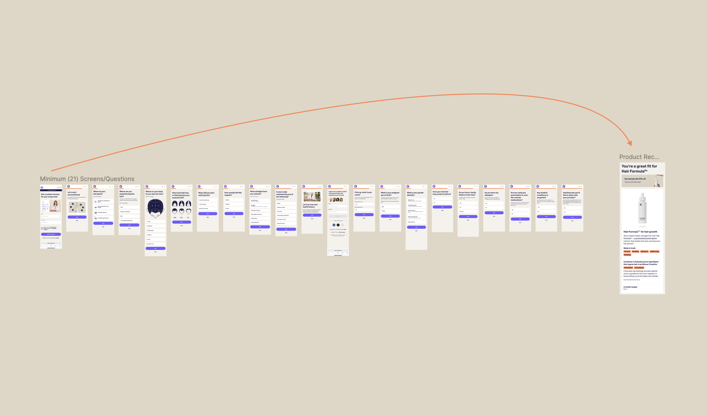
Our initial analytics and user research revealed a glaring barrier: cognitive load. The flow required users to answer between 21 and 37 questions before they ever saw a product recommendation. Most users abandoned the process early, but those who pushed through the initial slog demonstrated a significantly higher completion rate.
The problem wasn't the questions themselves; it was the timing. We were asking for deep commitment before delivering any emotional payoff. The user lacked clarity and guidance, leading to confusion and frustration. We hypothesized that by delaying friction and completely reordering the information architecture to focus on education and excitement, we could save the funnel.
Step 1: Delaying the Commitment (Account Creation)
In traditional SaaS models, securing the email and creating the account is prioritized above all else. In a 37-step medical flow, it acts as a massive roadblock.
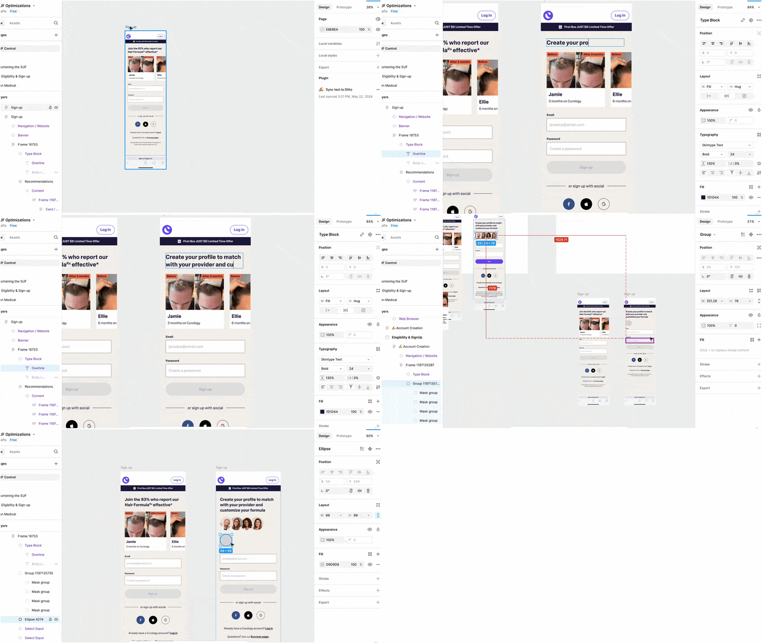
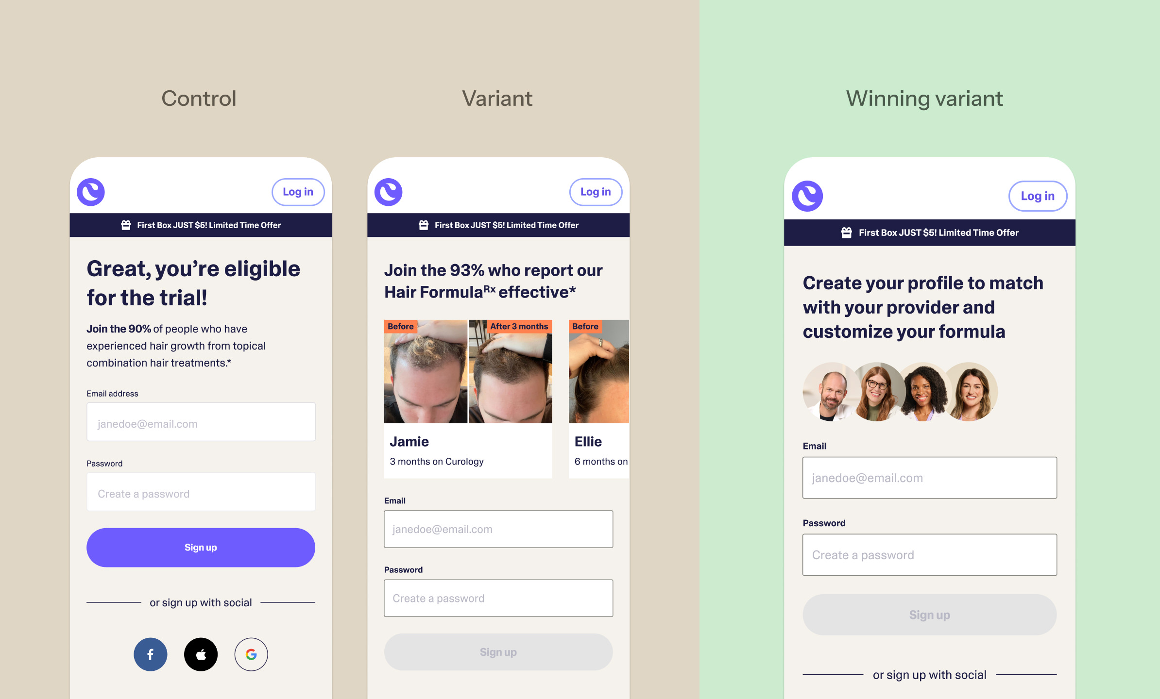
We moved the account creation step further down the funnel, creating a much more welcoming entry point. But we didn’t just move the barrier; we redesigned the content around it. Instead of a mandatory data-collection screen, we used content design to clearly explain the specific benefits and clinical purpose of creating the account.
The Impact:
1.6% decrease in abandonment simply by delaying the account creation step.
2.4% decrease in abandonment by optimizing the content design to explain the value of the account.
Step 2: The "Good News" Pre-Consult Screen
Asking a user to answer 30+ questions with zero immediate payoff is a recipe for high bounce rates. To fix this, we introduced a critical piece of information architecture: the pre-consult approval screen.
We executed a major reorder of the questionnaire. We pulled the heaviest, most detailed medical questions out of the front of the flow. Instead, we asked just enough initial questions to determine if Curology actually had a viable treatment for the user.
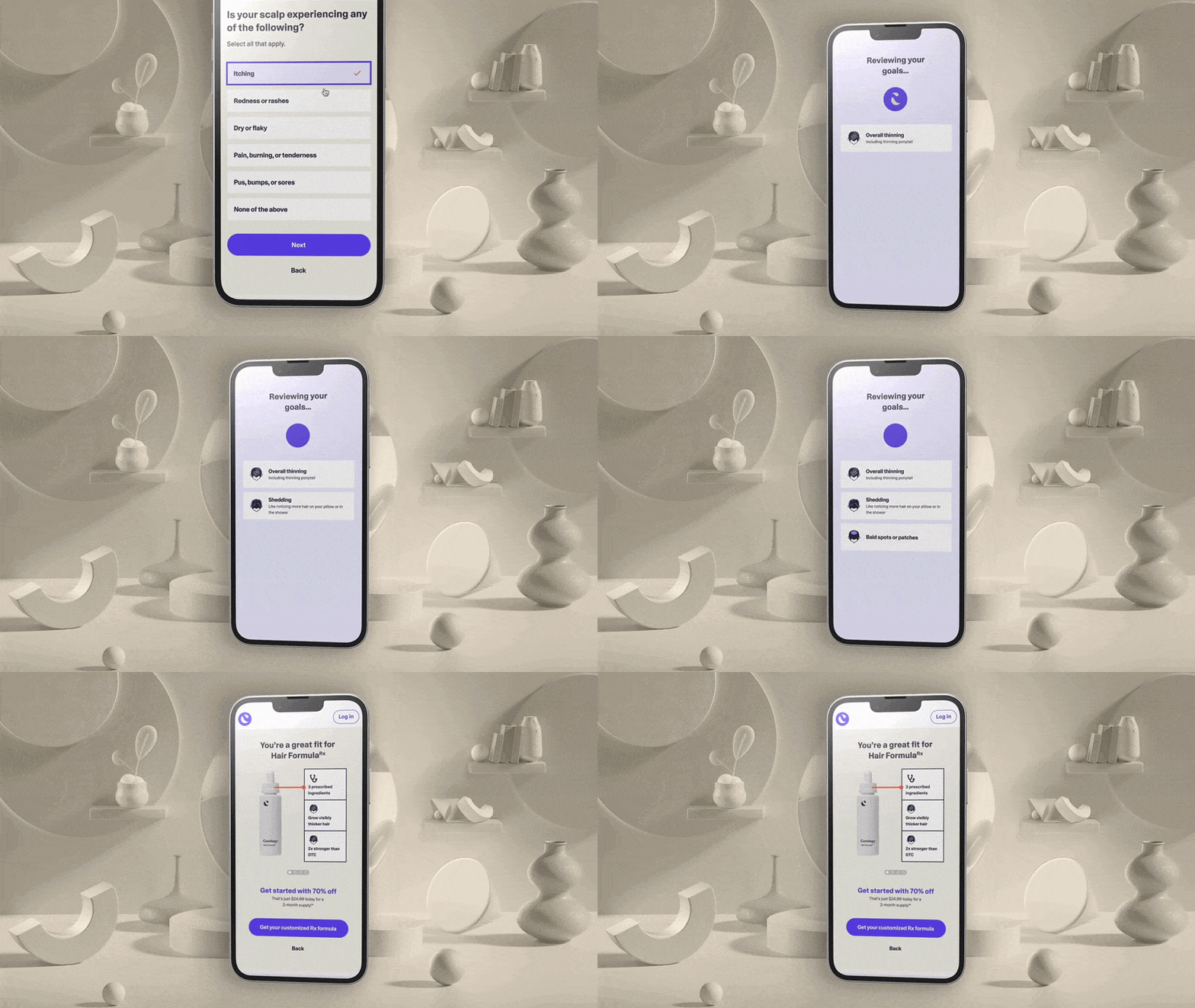
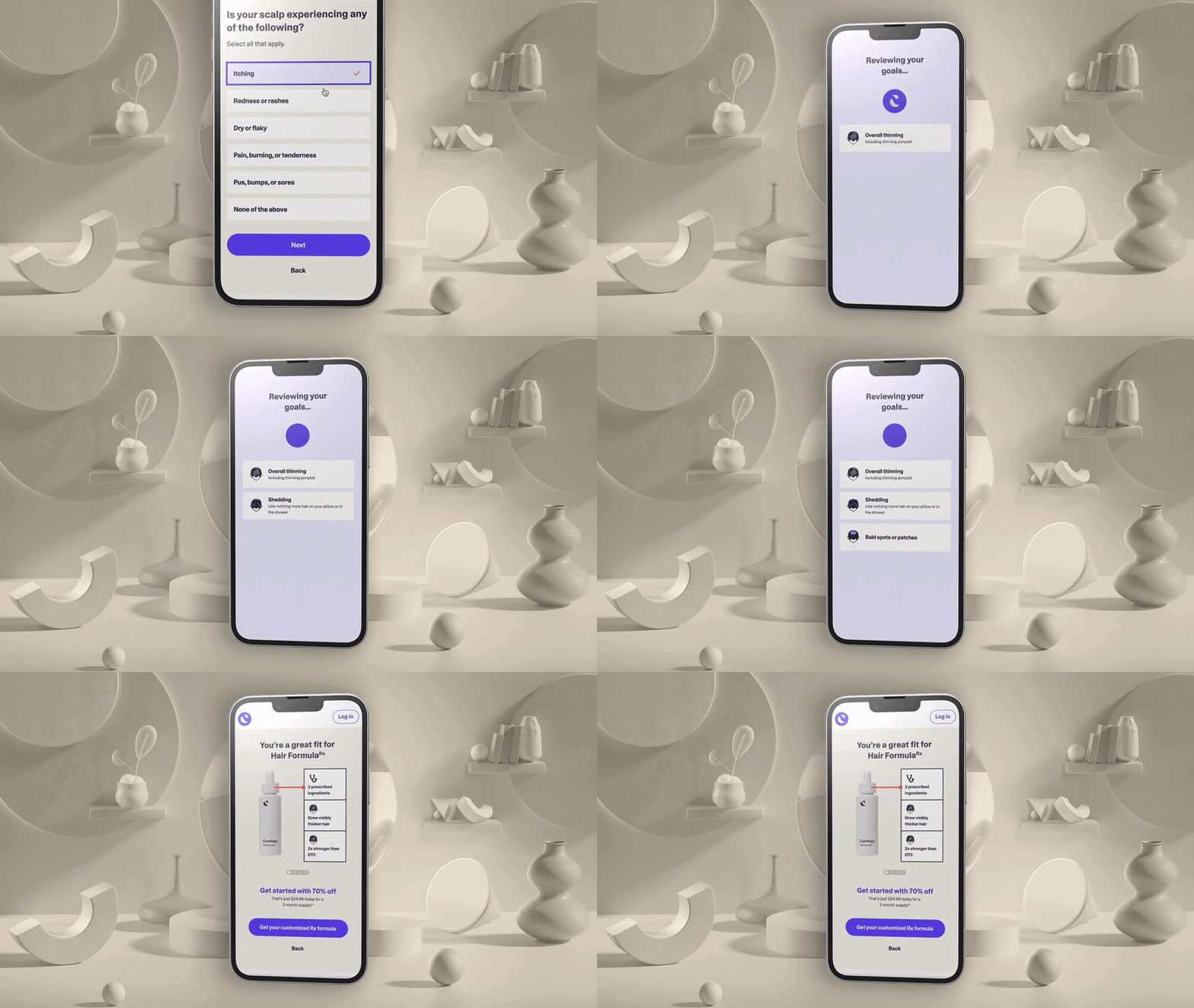
Once that threshold was met, we interrupted the flow with a personalized approval screen: "Good News, we have a treatment for you." This included personalized product details and initial offers.
By delivering this emotional payoff early, we boosted user confidence. The user was now excited and invested, making them far more willing to complete the grueling personal medical questions that followed.
The Impact:
4.4% increase in account creation further down the funnel, driven entirely by the confidence built on this single pre-consult screen.
Step 3: A/B Testing the Micro-Interactions
Conversion Rate Optimization (CRO) lives in the details. Once the overarching architecture was fixed, we tested the micro-interactions to ensure every pixel matched the user’s emotional expectations.
Contextual Discount Messaging
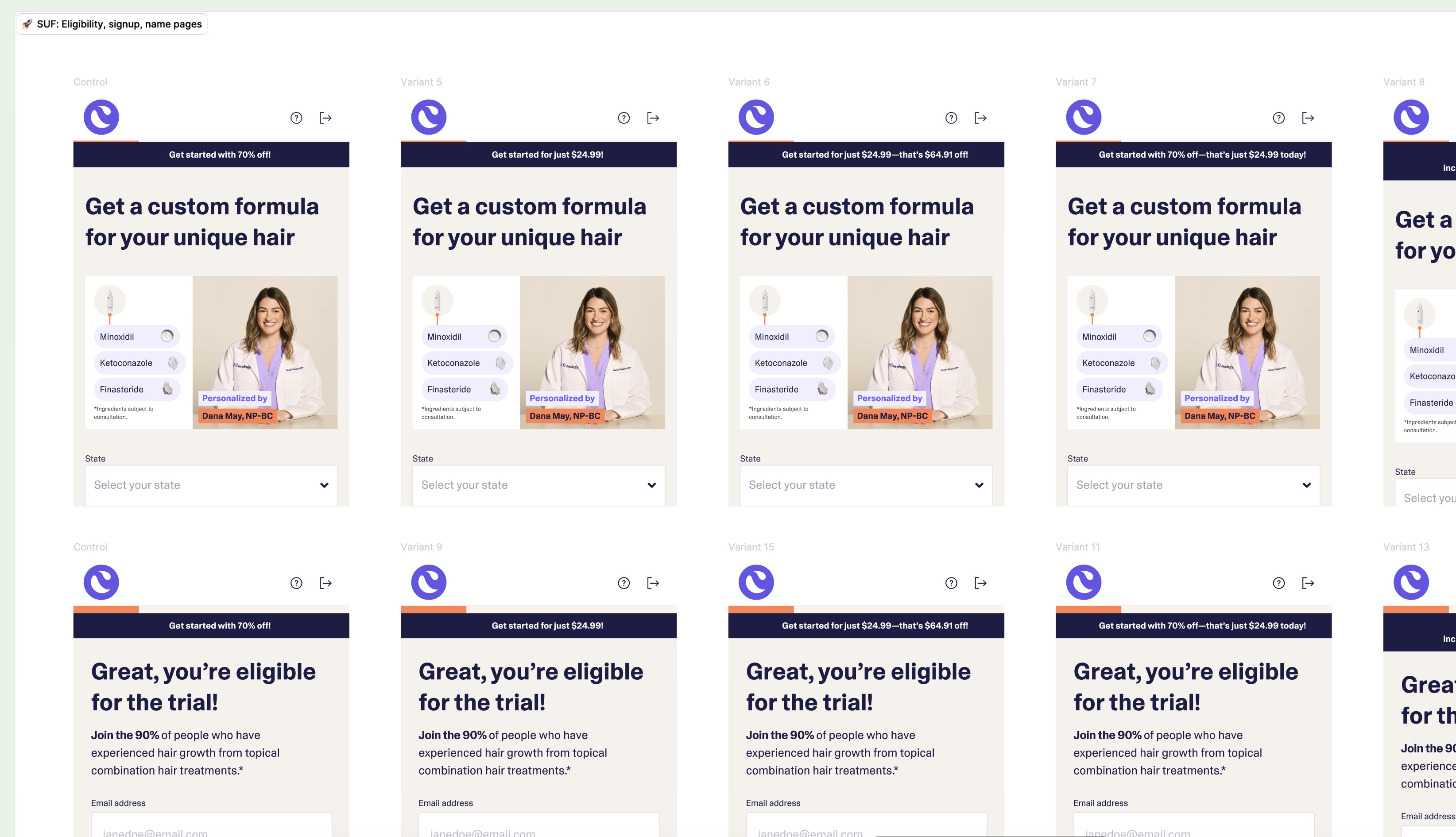
We ran extensive tests on where to place sign-up discounts and special offers to maximize conversion without feeling cheap. We tested placement before the quiz, after the quiz, and on the approval screen. We A/B tested anchoring the offer to the top of the recommendation page versus locking it next to the "Continue" button, and placing it at the top of the checkout page versus directly within the payment module.
Frictionless Age-Gating
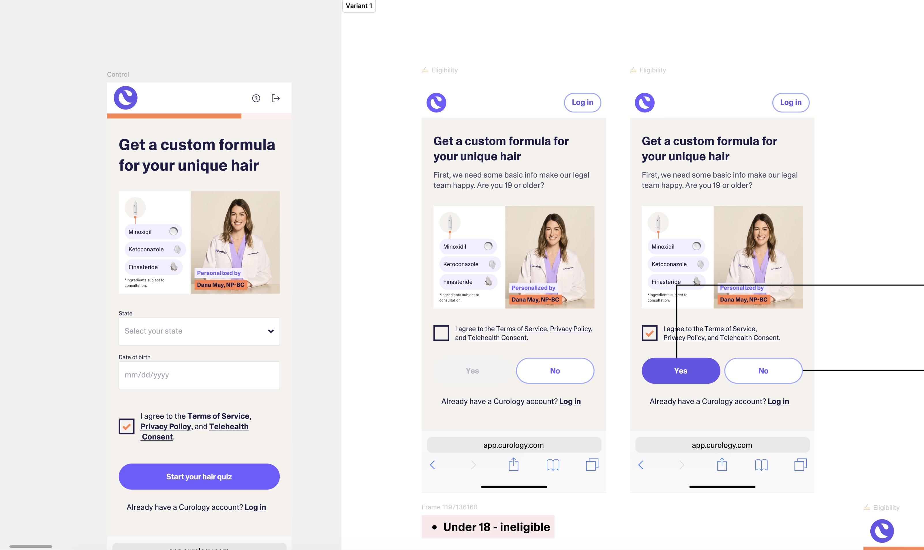
Legal compliance requires an age gate, but asking for a full Date of Birth upfront creates unnecessary friction. Knowing the vast majority of the target audience would be 19+, we designed a conditional age gate. The primary verification became a simple, non-personal checkbox. Only if a user selected the "19 and under" criteria did the UI expand to request their exact state and DOB.
Contextual Data Entry
We analyzed the emotional weight of typing in a legal name. We tested moving the "Patient Name" fields out of the initial "Eligibility & Sign Up" phase and pushed it to the final "Recommendations & Checkout" screen. By placing the patient name inside a structured container alongside other final checkout details, the data entry felt natural and transactional, rather than invasive.
Step 4: Progressive Disclosure and Contextual Grouping
One of the biggest hidden culprits of cognitive friction in medical questionnaires is the standard "one-question-per-page" format. Previously, Curology's flow forced a hard mental reset for every single interaction.
For example, if a user was asked, "Have you tried hair loss products before?" and clicked yes, they were pushed to an entirely new screen asking, "What products did you try?" While the questions are related, the disconnected UI forced the user to constantly context-switch. This fractured experience made the questionnaire feel artificially long, exhausting the user before they even reached the finish line.
To solve this, we overhauled the quiz structure by implementing a progressive disclosure model. We moved from isolated pages to a "tap-and-reveal" experience. Now, if a user taps "Yes" to trying previous products, the follow-up question dynamically expands directly beneath their answer on the exact same screen.
By visually tethering related questions together in a single container, we eliminated the context-switching penalty. The user no longer has to remember the premise of the previous screen. This subtle structural shift drastically reduced the user's cognitive load, making a dense clinical diagnostic feel like a fast, conversational experience.
The Bottom Line
A beautiful interface cannot save a fundamentally flawed user journey. By aligning the content design with the user's psychological state—delaying the hardest questions until after we built excitement and trust—we turned a fragmented rollout into a highly profitable acquisition channel.
The Final Results:
↑ $522,000 in annualized revenue for a single product line.
↑ 720+ new subscriptions generated per month.

.gif)

.gif)