

When you are tasked with redesigning the digital front door for one of the most widely used data science tools in the world, the challenge is a relentless balancing act between high-level aesthetics and deep infrastructural architecture. You cannot compromise on one to solve the other.
Google Colab was undergoing a massive evolution. It was no longer just a free Jupyter notebook environment; it was transforming into a deeply integrated, Gemini-powered active collaborator. The assignment was to build a cohesive digital experience that visually communicated this paradigm shift to a highly technical audience.
To execute this, Left Field Labs partnered with Art of Wednesdays, bringing us in to spearhead the structural design, content strategy, and visual direction directly for Google.
The immediate hurdle was executing a cutting-edge, AI-driven visual narrative while being strictly confined to the rigid framework of the Google Dev Kit. We had to push standardized visual components to their absolute limits to create a premium aesthetic, while simultaneously re-architecting a frictionless user journey.
Here is how we engineered the outcome.
The Content Strategy: Choosing the "AI-First" Narrative
Before pushing a single pixel, we had to determine how to talk to the user. We developed four distinct content design architectures:
- Evolution: An educational, tutorial-style approach focusing on practical impact.
- User Mindset: An empathy-led structure addressing the hurdles and friction of getting started.
- Feature-Focused: A strictly technical breakdown of GPU/TPU specs and Python integrations.
- AI-First Colab: Positioning the platform as an intelligent, active assistant rather than a passive tool.
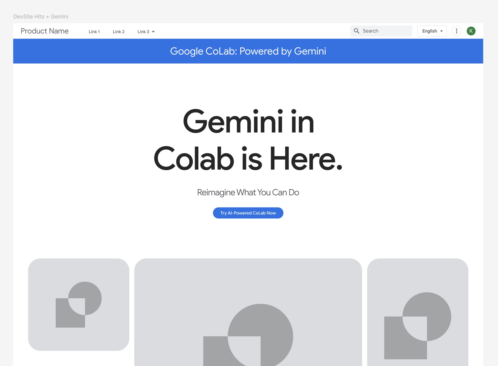
We aggressively pursued the AI-First direction. To sell the inclusion of the Gemini-powered "agentic collaborator" and the advanced Data Science Agent, the platform needed to feel alive. We provided full motion art direction and content strategy, ultimately delivering the complete, approved framework to the originally contracted content agency after nailing the UX wireframes in just two rounds.
Cognitive Load & Content Architecture
A common trap in highly technical product redesigns is relying on walls of tutorial copy to explain complex features.
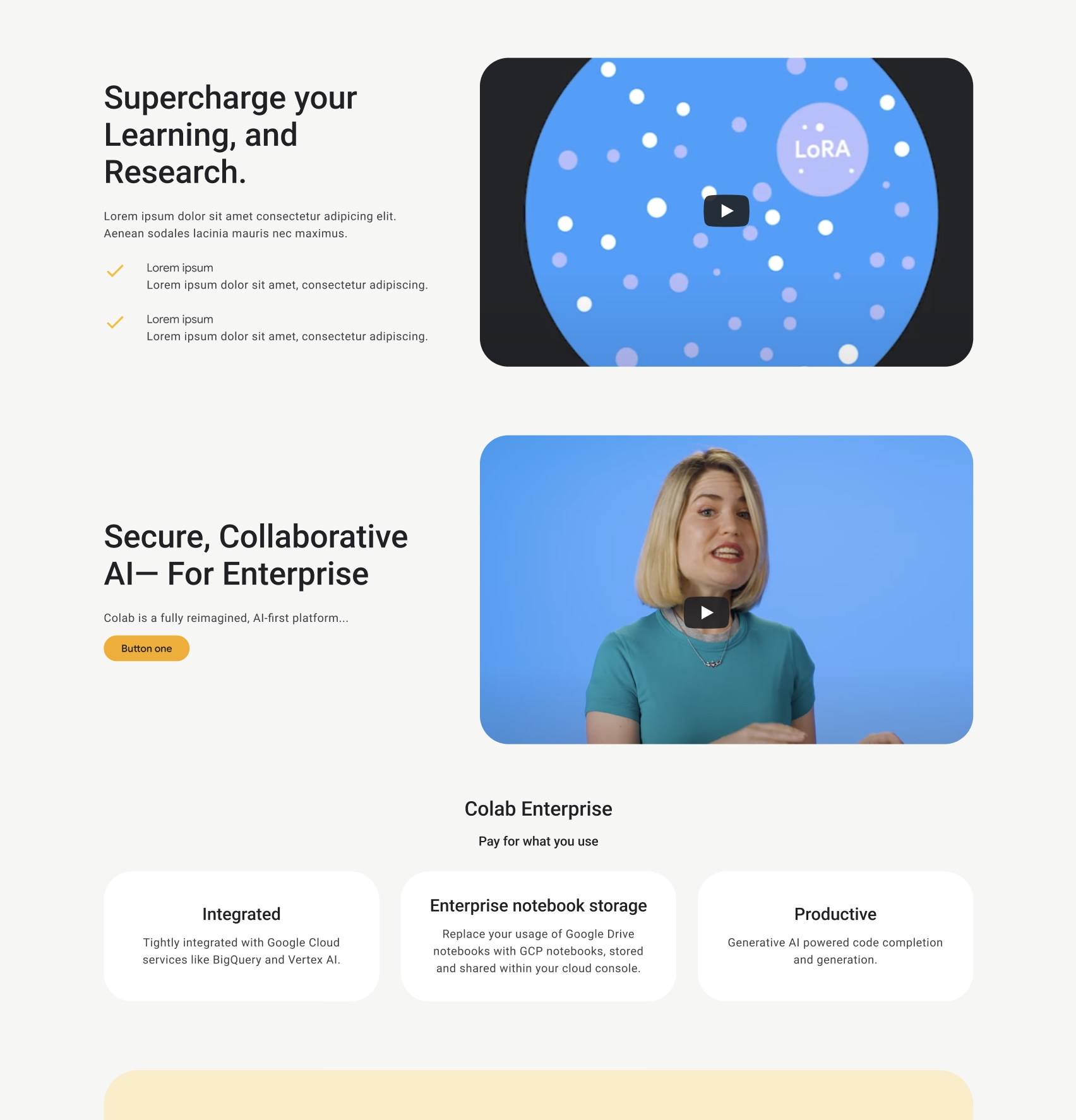
During our initial mapping, we recognized that the internet was already saturated with high-quality Google Colab "how-to" videos. Instead of fighting that tide, we utilized it. We stripped away massive blocks of explanatory text, re-architecting the page to use punchy copy snippets that directly supported embedded video and image content. This drastically reduced cognitive load, allowing users to scan, watch, and understand the value proposition in seconds.
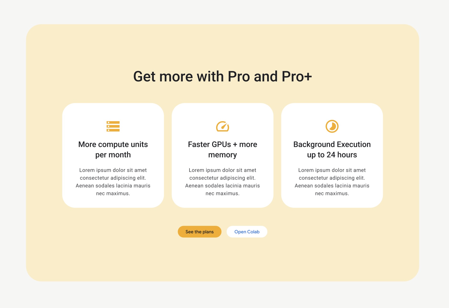
Simultaneously, we structured the conversion funnel. We anchored the site around a tiered subscription plan, ensuring that the user journey logically resolved into clear, appropriate upsell pathways without feeling intrusive to the free-tier users.
Calculated Aesthetics: Bending the Dev Kit
To make the "AI-First" narrative land, the visual execution needed to feel native to a developer's environment.
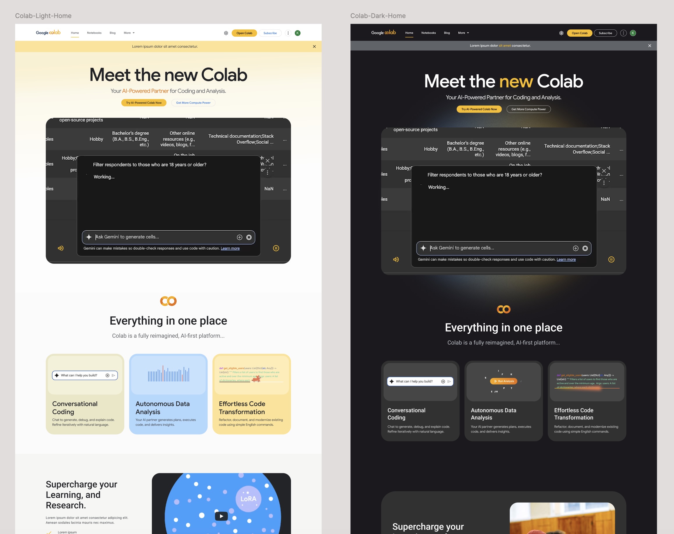
We initially designed a light theme to align perfectly with standard Google web aesthetics. However, rapid testing and strategic alignment proved it was the wrong move. We pivoted the entire architecture to a dark theme. This wasn't just an aesthetic preference; it was a psychological cue. A dark UI better supported the mental model of a heavy-duty, AI-packed coding environment and drastically improved the contrast and hierarchy of our motion assets.
To push the strict visual boundaries of the Google Dev Kit, we executed what we internally call "visual gymnastics"—manipulating the allowed components to their absolute maximum limits to create depth, modern layouts, and visual interest that the kit wasn't originally designed to support.
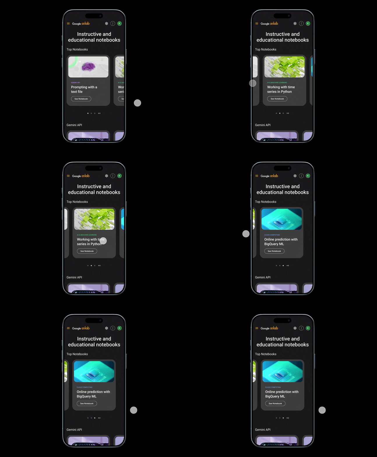
Finally, to bridge the gap between education and onboarding, we engineered a dynamic Notebook Gallery. Instead of generic thumbnails, we utilized a visual library of AI-created artwork explicitly tied to the subject matter of popular example notebooks. This created an interactive, highly visual starting line for users to learn by doing.
The Result
We didn't just deliver a reskin. By operating as a strategic partner alongside Left Field Labs, taking command of the content strategy, aggressively managing cognitive load, and bending a rigid enterprise dev kit to our will, Art of Wednesdays built an acquisition engine that accurately reflects the AI-first future of Google Colab.

.gif)

.gif)